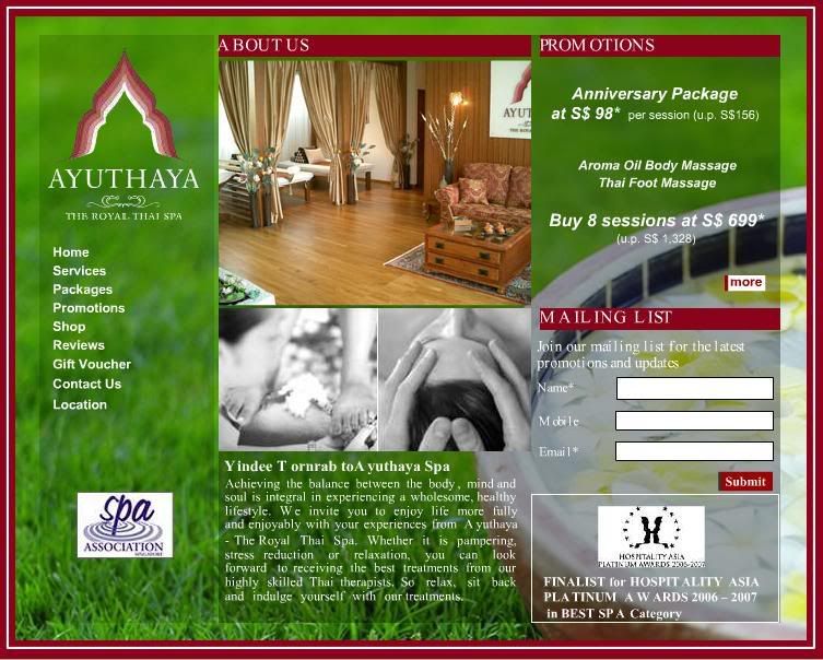
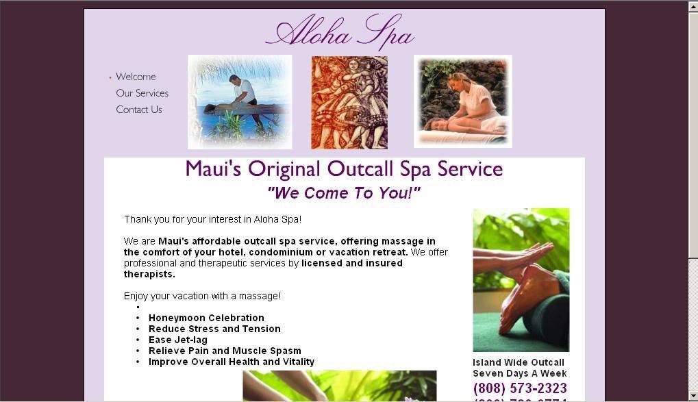
Sunday, February 10, 2008

Design Agency

Big Spaceship


http://www.bigspaceship.com/


Big Spaceship is a great design agency with 8 years of solid experiences in US. They have done many projects for big clients such like nike, adobe, hbo, billbboard etc. They most oftenly do projects for movies and games included the movie Spiderman, 30 days of night, LOST, underworld and many more.

Sunday, January 27, 2008

6 Dbcut Websites

  1. Slap Shot

  2. http://slapshot.nexon.com/slapshot/Page/Gnx.aspx?URL=Home/Index


    This is the official Website of the game Slap Shot. It contains a lot of high quality and nice graphics. Thus, it successfully brings out the mood and feeling of the site. In the term of content design, among most of the korean website that I visited, it can considered one of the most well-arranged and easy to navigate site. First, it has its logo placed formally on the top left and the main navigations bar beside it. Sub-navigations display while rolling over the main navigations and appear on the left side beside the contents area when the page is accessed. Lastly All the contents are all well fit in in the contents area in the middle. However, I think the size of this website is too big and it would be better if it can fit in well in the window.


  3. Motorola Z6M

  4. http://z6m.mymotorola.co.kr/default.htm


    This is a cellphone official website for the Motorola Z6M. This site contains simple and clear information about the Motorola Z6M. The site is built with full flash, and enabled it to come out with nice effects and transitions. It has good contents arrangement with it manage to put all the contents and information about the phone clearly just in 4 navigations. In the term of colour and mood, it successfully brings out the identity of the products and in the same time, it blended well with the contrast and mood. Basicly the entire site is creatively designed.

  5. Musical Talk

  6. http://musicaltalk.cafe24.com/main/index.php


    Interesting layout and nice graphic. Good hierachy of navigations and content design, easy to navigate.

  7. 30days of Night

  8. http://www.30daysofnight.co.kr/


    Basicly, the entire site is built with flash. It has nice transition and nice graphic. The contents are well arranged and the layout is consistently designed. However, I think a site which built with flash only, is not so flexible or convinient for changes and updating.

  9. Ivy Club

  10. http://www.ivyclub.com/


    Basicly, this site has intersting graphic, navigations design and art direction. The website also has a lot of moving graphic that make it very motivated. However, in the same time, this nature also became its weakness. Because of everything is moving in the same time, it makes the website looks too busy and messy. It could be irritating for the user who prefer to be relax. The contents are too pack and also the navigations. The navigations are all over the top, left and right of the site and all of them has sub-navigations. They are too many and too messy.

  11. Trash Buster

  12. http://tb.nexon.com/tb_cb/page/gnx.aspx?url=home/index


    This is a official website for the online game "Trash Buster". The art direction follows the game image and the navigations and title typefaces are also specially designed. Basically the whole website is cute and interesting. In the same time it is easy to navigate with the well arranged contents design. The colour mood of the site make the site looks very refreshing and young. Suitable for an online game site which target audience on kids and teenagers.

Sunday, January 20, 2008

Mission Statement & Goals

Mission Statement

In the busy society nowaday, people is being stressed time over time. From time to time, they need some activity for self solitude, space and peace to recharge batteries. Therefore, spa has became one of the important activity for them to encourage the renewal of mind, body and spirit. Angsana spa is one of the popular spa in world wide . Its services are available in many countries, even included U.S., U.K., Australia and Japan. As a popular and world wide spa, it should have more professional and world standard website. Informations and conviences such as corporate informations, services details, online booking, online shop and so on, should be clearly displayed and provided for the costumers. Other than that, in the term of design as a spa website, it should give the feel of elegant and the mood of relax for the visitors. Contents also should be well planned with good hierachy and flow. The entire site should be user friendly and easy to navigate, this can ensure the costumers stay relax while surfing the site. Flash banner or image should be added for the promotions and advertisements, so that can fully use the ability of flash, and also can make the site more motivate and interesting, rather than just fixed texts and images. Background music also can be added to enchance the overall relaxing feel and mood of the site.


Goals

-Clear Corporate Details and Services Introduction.
-User Friendly, Convinience, Fast Loading.
-Neat, Clean, Easy to navigate.
-Promote and Advertising, to ttract more customer and save budget for advertising.
-Elegant and Classy
-Mood of Relax and Comfortable.
-Online Shop, increase online sales.
-Online Booking, increase the convinience of customer and chances of bussiness.
-Member Club, convert short term customer to long term customer.

Competitors Website Analysis

  1. Ayuthaya Spa


  2. www.ayuthayaspa.com


    1.1 About The Company

    Ayuthaya Spa- The Royal Thai Spa, was the Finalist for the Hospitality Asia Platinum Awards 2006-2007 in Best Spa Category. Services provided included Massage, Body Wellness, Facial Treatment, Manicure and Pedicure. Other than that, they also introduce Spa Packages like Ayuthaya Total Zen, Thai Herbal Heat Revival, Thai Sanctuary, Thai Herbal Harmony, Senses Reviver and Stress Recovery. Prices are in between $128-$188++.


    1.2 Official Website Analysis

    Layout Design:
    i) Fixed background.
    ii) Fixed frame.
    iii) Fixed Grid. 1 row 2 column.

    Theme Colour:
    Red, White, Green.

    Typeface & Fonts:
    San-Serif, white.

    Navigations: All on the left included:
    i) Home
    ii) Services
    iii) Packages
    iv) Promotions
    v) Shop
    vi) Reviews
    vii) Gift Voucher
    viii)Contact us
    xi) Location.

    Effect & Transition:
    i) Fade in.
    ii) Page Transition from top to bottom.
    iii) Navigation hover effect- red highlight while rollover.

    Contents Design:
    All navigations are on the left and all contents are on the right. Boxy frames are used to divided the contents. All images are in square shape. All texts are done in flash. No real text.

    Sound:
    Background music looping and navigations rollover sound effect applied.

    Building Method:
    Flash Based.

    Good points:
    - Background music applied.
    - Usage of flash.
    - Good in fitting in all the contents.

    Weaknesses:
    - Colour mood and feel doesn’t suit the company. Not relax enough as a spa website.
    - Too boxy.
    - Fixed background, frames, grids and transition. Boring.
    - Lack of interesting graphic.
    - No highlight for selected navigation.
    - Loading too slow.
    - Too centralized. Wasting of space.


  3. Aloha Spa


  4. www.alohaspamaui.com


    2.1 About the Service

    Aloha Spa is an outcall spa service. They offer professional and therapeutic services by licensed and insured therapists. Their services included Hawaiian Lomi Lomi, Deep Tissue, Swedish, Sports, Jet-Lag, The Duet, and Aloha Super Saver.


    2.2 Official Website Analysis

    Layout Design:
    i) Violet Background
    ii) Fixed white frame.
    iii) Fixed Grid. 2 rows 1 column.

    Theme Colour:
    Dark Purple, Violet, Black, White.

    Typeface & Fonts:
    San-Serif, black.

    Navigations:
    All on top left included:
    i) Welcome
    ii) Our Services
    iii) Contact Us

    Effect & Transition:
    None

    Contents Design:
    It is a vertical site. All the navigations are on the top left and all contents are all fitted in a box at the bottom. The main title is on the top center and there are three small low-resolution picture beside the navigations. Other than that, not much of other images, Graphic, logo or banner included. Basically the girding and contents
    are messy too.

    Sound:
    No sound effect.

    Building Method:
    Basic Html.

    Good points:
    - Direct enough.
    - Fast loading.

    Weaknesses:
    - Bad colour mood.
    - Too boxy.
    - Too plan.
    - Lack of interesting graphic.
    - Lack of content.
    - Bad typeface usage.
    - Messy girding.
    - Text layout is messy.
    - Too simple. No other plug-in included.
    - Boring.
    - Not professional.
    - Bad navigations design and placing.


  5. Ananda Spa


  6. www.anandaspa.com


    3.1 About the Company

    Ananda Spa is an award winning spa for year 2005-2007 The 21,000 square foot spa offers an extensive menu of over 79 body and beauty treatments, integrating the traditional Indian systems of Ayurveda with the more contemporary Western spa approach. The spa experience strives to achieve the ultimate harmony between the physical and the mental realms of the individual. Services provided included Yoga, Ayurveda, Spa Cuisine, Fitness and Spa Treatment.


    3.2 Official Website Analysis

    Layout Design:
    i) Yellow background.
    ii) Top and bottom navigations.
    iii) Fixed grid. 4 rows 2 column.

    Theme Colour:
    Yellow, Scarlet, Black.

    Typeface & Fonts:
    San-Serif, black.

    Navigations:
    Top included:
    i) Home.
    ii) Ananda Spa .
    iii) Ananda Facilities.
    iv) Wellness Retreats.
    v) Ananda Activities.
    vi) Honors & Awards.
    vii) Rates & Reservations.

    Bottom included:
    i) Reaching Ananda.
    ii) Local Information.
    iii) Gallery.
    iv) Career.
    v) Contact Us.
    vi) Site Map.
    vii) Newsletter.
    xi) Expression.

    Sub-navigations appear when rollover the main navigations.

    Effect & Transition:
    Sub-navigations drop down when navigations rollover.

    Contents Design:
    There is a flash banner at the most top of the site, follow by the first main navigation bar. All the main contents are placed in frame in the middle of the site. Lastly at the most bottom is the second main navigation bars. Besides that, sub-navigations are shown as a drop down menu when the main navigations being rollover. All images and texts are placed following the same grid system in every pages.

    Sound:
    No sound effect.

    Building Method:
    Html, Flash.

    Good points:
    - Consistent layout.
    - Consistent colour.
    - Full of contents. Detail.
    - Neat contents arrangement.
    - Good in putting in all the contents.
    - Uses flash banner.
    - Rollover drop down sub-navigations. Saved space and allow to put in more contents.

    Weaknesses:
    - A little too pack.
    - Too boxy.
    - Lack of interesting graphic. Too many texts.
    - Boring.
    - Colour mood not relax enough as a spa website.

Saturday, January 12, 2008

3 Corporate Websites

  1. SONY

  2. http://www.sony.com/SCA/index.shtml

    Corporate website for Sony Corporation of America. It is vertical base and overall divided into 8 rows and 2 columns. The theme colors are white, blue and grey. White is used as background color, blue as title, and grey for text contents. The same style of fonts are consistently applied in this site which is san-serif. Different sizes and weights of fonts are also applied for different purposes of the text.


    SCREENSHOOT


    GRID


    This site contents 3 main navigation bars. The brand logo is on top left and follow by the first main navigation bar below it. This navigation bar apply invert as the roll over effect, and sub-navigations appear in the drop down menu when hover. The second navigation bar is vertical and located on the middle left after the banner, and on the right is the main contents. In the navigation bar, selected navigation is highlighted with blue background and white text. Invert is also used as the roll over effect.The last navigation bar is very tiny and located at the bottom of the page. It don't catch too much attention and it only have simple effect which is underline when roll over.

    Overall, I think this site is quite standard and simple. It is consistent in colors, fonts and style. It is full in contents while looks clean and easy to navigate. The only thing that I think not good enough is it is too clean and simple which make the site looks boring. In my opinion, maybe they should apply flash banner..


  3. PEPSI

  4. http://www.pepsi.com/pepsi_brands/index.php

    The corporate website of Pepsi-Cola. The theme colors of the site are blue and white. Different scale of blue are used to different-shape different purpose of the text. The same style of fonts are applied, which is san-serif.

    In gridding term, this site has different kind of grids depending on its contents. However, basicly the top and bottom gridings are the same, while the middle grids changes to fit in the contents.


    SCREENSHOOT 1


    GRID


    This is the brand and products page of the site. Basicly, it is divided into 3 main rows and 1 column, with the top row contents a few tables, which included the logo and the main navigations. The middle part is blanked to fit in the flash and the bottom row is another navigation bar which divided to few columns.

    In another page, which is the corporate page, the gridding has a little different. The middle part is divided into 2 columns to fit in the images and the text contents. Other than that, all the grids are the same.


    SCREENSHOOT 2


    GRID


    I like the theme and the mood of this website, and basicly everything is well organised and consistent. It also applied a lot of flash that make it looks more interesting. However, when I surf through the corporate page, I found that the background color of the main text contents in the middle suddenly change to grey. It looks like the texts are overflow the layout. I think it will looks better if the original gradient of the background in the layout continue.


  5. PILOT (TAIWAN)

  6. http://www.pilot-pen.com.tw/about.htm

    This is the homepage of Pilot Pen in Taiwan. This site have simple gridding, and the theme colors are white, blue and black. It is basicly divided into 4 rows 1 column, with the logo located at the first row, main navigations second, main content in flash in the middle and last the disclaimer.


    SCREENSHOOT


    GRID


    This site is simple and interesting with the usage of flash elements. It is overall consistent and easy to navigate.

Monday, November 5, 2007

Instructional website

http://laphael.seaofmirrors.com/littlemakeupcorner/index.html
-This site teaches how to do oshare kei make up steps by steps.

http://www.diynetwork.com
-This site has many DIY tutorial for different catogary.

Monday, September 17, 2007

5 good websites


  1. H.Naoto
    http://www.s-inc.com/hnaoto/heaven


    +Interesting navigations


    +Interesting and creative loading


    Conclusion:
    H.Naoto is a high-class fashion brand in Japan which majors in gothic, punk and outranges fashion designs. It is very famous amongs teens in Japan especially in Harajuku. This website has a creative concept where the designer uses the human body organs as the main theme and navigation, which I think it matches with the image of the brand. I like especially the loading page, although maybe it looks a little creepy to some others, but I think it is interesting rather than juz a loading bar. It has consistent griding for the layout, contents, fonts, colors and navigations. The main colors of this site is black and white and red for highlights. It might looks complex caused by the anatomy graphics and ornaments, but actually it has a simple grid system and easy to navigate. However, it takes sometime to load.


  2. Hotlink
    http://www.hotlink.com.my


    +Interesting interface


    Conclusion:
    This is the official website of Hotlink. The mainpage interface is interesting, where the main promotion of the month is highlighted in the wheel in the middle. This theme color of the website is red and white, which is the brand color of hotlink. This website has 3 navigation bars and all of them are in a consistent grid layout. It has very full and complete contents and info in the sub-navigations. It also has consistent fonts and its easy to navigate. However, the contents are too complete and caused the website and the navigations looks a little messy.


  3. Nike's Official Online Store
    http://www.nike.com


    Conclusion:
    This is the website for Nike Official Online Store. It has consistent griding for the layout and navigations. It has nice product overviews for every catogaries. It is easy to navigate and will leads to another sub-navigations once a navigation is clicked. It has very detail contents and info. It is good in a way where user can have a clearer about the products but it also caused inconvinient because it is too clumsy and messy to go through so many steps to get into the details.


  4. PSP
    http://www.us.playstation.com/psp_interactive


    Conclusion:
    This is the Official website of PSP US. It has a simple and clean layout which makes a lot of convinient for all ranges of users. It has a user friendly interface which can clearly explain the features info of the PSP, such as 360 angle spin open and interactive interface. The grid system of the website is consistent where every contents and navigation is placed neatly and easy to navigate. It also has consistent fonts and color. The theme color of the site is grey black and light blue, with white background. Although clean and simple is easier to navigate, but as a high-tech products, I think the theme layout colour is a little too dull and a little too simple.


  5. FURI FURI COMPANY
    http://www.furifuri.com/2005/furifuri2005.html


    Conclusion:
    This is the official website for Furi Furi Company. Basicly, of all the websites here, I think this is the most interesting and best of all. It has very interesting and creative interface and also very attractive graphics and colour. Other than that it also contents background music and interesting sound effect. It has very creative buttons where every of them is different and has different sound effect when hover. The entire site is interactive and easy to navigate. The contents and info are quite complete and all of them are well arranged under a consistent navigations and layout. The best part is although it contents a lot of effects and info, it is not that heavy and the loading time is quite fast. But unfortunately, the outcome is not so consistent in different browser.